The first session of CTS Brand Busting was very interesting, this is what I would call a great and powerful beginning. Amongst many other topics, we talked about storytelling related to brands. This is also known as ‘Storybranding’.
The eventual aim of every brand is to sell. However brands can either advertise products to purchase or brilliantly create an entire story behind the brand to get sales by itself. This way, the brand would establish an enduring relationship with the consumer that would guarantee the ‘repeated purchase’. Thus, it is smart to think that the more people relates to a brand, the more will the sales increase. Indeed, the current president of ‘Story-Lab U.S.’ and author of ‘StoryBranding 2.0.’ (2014) stated that “A product’s purpose is functional. A brand’s purpose is meaningful.”
Hence, how can this lasting connection between consumer and brand be achieved? Basically, it consist in creating the soul of the brand, its values, its ideology. In the end, all we aim to is to make people feel identified with the brand. Almost as inventing an always supportive friend: no matter what, this brand will always be a guaranteed value you can trust to fulfil your needs and a ‘friend’ you can always rely on in your next purchase.
Yet, how are the brand identity and its values created? First of all, it is key to understand and analyse the background of the brand to identify the values this brand stand for. The second is relating these thoughts with the brand. Once this is accomplished, it is time to realise which is the profile of the target market and where is the gap the brand can get to them. In other words, distinguish which needs are still not fulfilled that the brand in question can and let the brand reach the prospects through this little gap.
For instance, the energetic drink Red bull is not introduced as a questionable nice flavoured drink made with peculiar ingredients but as a drink for the unstoppable, the adventurous, the ones with no limits. Red Bull is a drink specially made for them, that understand their desires and encourages them to keep it up.
Red Bull advert “Find Your Wings”
Eventually, there might happen to be some obstacles. The only way to face them correctly is by being aware of this possibility since the very beginning and stay firm when they arrive to even broaden the meaning of the values they stranded for since the beginning.
To sum up, story branding is a lifelong method brands can use to get a loyal spectrum of consumers by focusing first on their own story and then on prospects’ needs to find an unbreakable connection between them.
_______________________
References>
Dahlia, M. and Lange, F. and Smith, T. (2010) ‘Marketing Communication‘.Chichester: Willey.
Signorelli, J. (2014) ‘StoryBranding 2.0.‘. Austin, Texas: Green leaf Book Group Press.
This lecture aimed to give an overall vision of Modernism and its key points regarding fashion, people’s taste and society.
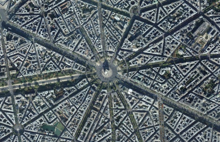
First of all, we were presented the figure of the ‘flaneur’ which is a French term to describe those who just like to wander and stroll aimlessly around the cities in a very slow and calm pace discovering the cities and the society that inhabit them. This particular personality was fundamental for the French senator and member of the Parliment, Georges-Eugène Haussmann (1809-1891) who aimed to enhance the city for the wellness of the people by creating more open spaces like parks that would encourage people to walk through new streets that have never before dared to step on. He used a grid system to make the city geometric so that people would be able to navigate more easily and stimulate the social activity of Paris. This idea was named ‘phsycogeography’.
Flaneur wandering around the city.
So by this, we can understand that this concept of city that we have nowadays have not always been like this, and that cities were not thought as the urban scenario that are today where we expect to find many different activities to do by wandering all around.
The grid system of Paris by Haussmann
By applying these ideas into the city, the evidences between different social classes became more obvious and clear. This lead to a class system where people’s taste was linked to their status. However we realise throughout the lecture that taste has nothing to do with the status or the purchasing power, but with what we saw, learned and received since we were born. So actually tastes were passed on from generation to generation.
Nowadays, according to the theory of the French contemporaneous sociologist, Pierre Bourdieu (1930-2002), our tastes are as well set for us beforehand, as the media and publicity send those images and messages of what we should like. A great example is the catalogue of the Sweden company ‘IKEA’, where all those ideas decorations and furniture are so ideal and attainable regardless our social status.
IKEA Catalogues of ideal houses
What’s more, our tastes is now considered a way to self-improvement as the English educator Mike Featherstone claimed: “consumer culture publicity suggests that we all have room for self-improvement and expression whatever our age or class origins”. The Kardashian’s show was used in the lecture to exemplify how someone can become a brand that actually sells you the idea of self-improving by your own taste elections.
The Kardashians’ Show (example of self-improvement)
It’s kind of scary to realise how advertisement define for us our tastes and choose for us what we need. We make in class the exercise of thinking about how many adverts of products we might like pop up every time we surf on the Internet. This is an absolute privation of our intimacy, which can be related to the second part of the lecture about the pleasure of gazing. Recently, the popularity of realities that sneak into other’s houses increased considerably and TV productions take advantage of the inherent predisposition of human-beings for gazing and the pleasure we get from it.
All in all, our tastes, doesn’t matter who originate them, are gonna catch some eyes due to the strong inclination of people to stare at others. And probably, everything is just a vicious circle where people feed back from what they see to make a selection of their own tastes.
Reference List
October, D. & Hauer, G. (2016) Kay Catalogue, Modernism and Fashion Persuasion [Lecture to GMD Year 1] T303: Contextual and Theoretical Studies. UAL
This lecture had a very clear purpose, discuss about the importance of grids and whether they are essential or not. So, let’s get the ball rolling with the ‘pro-grids’ ones:
The Swiss graphic designer Josef Müller-Brockmann (1914-1996), known for his constructivists designs, described that the work of the designer needs to have “the clearly intelligible, objective, functional and aesthetic quality of mathematical thinking” and continued with a long list of all the virtues he considered of the grids such as its consistency, the rationality of creative and technical production processes, the ease to integrate colour, form and material and the dominion of space and surface. He considered that “work done systematically and in accordance with strict formal principles makes those demands for directness, intelligibly and the integration of all factors” and that “working with the grid system means submitting to laws of universal validity.”
This last point is very interesting as human-beings, like the nature and the entire universe, have this genuine and inherent desire of order and organisation. Indeed we can find clues of this tendency in the way society is organised, our daily life and even on our spare time. Furthermore, the fact of having tools such as the grid to create this order, make it easier for our brain to create links between contents when we look at a page, for instance.
The grid, therefore, was agreed for many designers like German relevant typographer Jan Tschichold (1902-1974), architects like the French modernist Le Corbusier (1887-1965), and artists like the Dutch suprematist Piet Mondrian (1872-1944) to be a funcional and clear way to convey the message as well as international and universal. Moreover, the grid was considered to show the criteria and creativity of the designer as it proves that the decisions aren’t taken randomly but following an order. Müller-Brockmann concluded in his book ‘Grid Systems in Graphic Design’ (1996) that “every visual creative work is a manifestation of the character of the designer. It is a reflection of his knowledge, his ability and his mentality.”
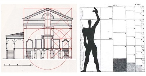
Mondrian (1929) Composition with Red, Yellow and Blue IIILe Corbusier’s grid system applied to people and architecture
On the other hand, the ones against the grid system like William L. Fox argued in his book ‘The Void, The Grid & The Sign’ (2005) that “the grid exercises authority over space by applying a ruler to it in all senses of the word” and also that “as an artificial extension of our egocentric visual triangulation of the world, the grid is always suspect”. In summary, all those ‘anti-grids’ considered it as “spatial signature of modernity” made “to control and discipline”.
According to the Canadian essayist and philosopher Marshall McLuhan (1911-1980) stated that the grids were used to create order but that it forgets the relationships between contents. Moreover, he criticised the fact that many urbanists were applying the grid, which was used in printing mediums, to organise cities, and therefore, the way people lived as if they were types. It was a “neutral and rational” according to the Dutch sociologist Saskia Sassen (1947).
The American grid towns
The American critic and theorist Peter Lunenfeld juxtaposed the the advantages and disadvantages of the grid in his book ‘Snap to Grid’ (2001) claiming that “the gains in predictability and accuracy are balanced against the losses of ambiguity and expressiveness”. So he was one of the pioneers who pointed out both the strengths and weaknesses of the grid system.
Furthermore, at the beginning of the 20th century the avant-gardes like the dada movement began to experiment with the collage which is a technique not opposed to the modernist grid but a thoughtful about representation, time and space. It was an absolutely visual media willing to convey how the world spoke, shouted and made sounds. That is to say, a new way to liberate the words -parole in liberta- and let them stand by themselves, which was very clearly represented, for instance, in the dadaist poetry.
Theo van Doesburg’s dada poster. (1923)
Collage (1919) von Hannah Höch [1889 – 1978] Bildmaß 114 x 90 cm Inventar-Nr.: NG 57/61 Systematik: Geschichte / Deutschland / 20. Jh. / Weimarer Republik / Kulturleben / Kunst und Literatur
Dada poster from Hannah Höch & Parole in liberta (right)
Baines, J. & Hartnett, JP. (2016) The debate [Lecture to GMD Year 1] T303: Contextual and Theoretical Studies. UAL
Fox, William (2005) The Void, the Grid & the Sign: Traversing the Great BAsin. Reno & Las Vega: University of Nevada Press.
Krauss, R. (1980). Grids. New York: Pace Gallery.
Lunenfeld, P. (2000). Snap to grid. Cambridge, MA: MIT.
Müller-Brockmann, J. (1981). Grid systems in graphic design. Niederteufen: Verlag Arthur Niggli.
Sassen, S (2000) New frontiers facing urban sociology at the Millennium. British Journal of Sociology.
Sennett, R. (1990) The Conscience of the Eye: The Design and Social Life of Cities. New York: Alfred A Knopf. This can be found online by putting the following words into Google: Conscience of the Eye Harvard pdf [don’t forget the pdf]
Thegreatamericangrid.com. (2015). The Great American Grid. [online] Available at: http://www.thegreatamericangrid.com [Accessed 8 May 2016].
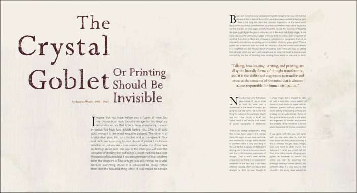
Text doesn’t need an image to stand by itself. Actually there is a metaphor that Beatrice Warde (1900-1969), who was a typography expert and publicity manager for the Monotype Corporation, uses in her book “The Crystal Goblet” that explains it pretty well: you have to worry about what’s inside the goblet not about the goblet itself. That is to says that the content is much more important than the contender. Despite so, the typography needs to have a relation with the content because, otherwise, it would be just decoration.
Beatrice Warde (1955), ‘The crystal goblet’ or ‘The printing should be invisible’.
We were supposed to understand that typography interferes somehow with how we read and also that the typography needs to be entertaining by its own. This is one of the main principles of 8vo, a graphic design firm founded by Simon Johnston, Mark Holt and Hamish Muir back in 1985. They created, for instance, a new -and weird- disposition for a essay to make it more entertaining, engaging and appealing to the eye.
Design by 8vo.
To sum up, the typography has to work for the text and it is graphic designers jobs to create the relationship between these two subjects. As once the American famous graphic designer, David Carson, (1954) did. He tried to fit a text he was given to the blank space he had by using a 5p font.
Nevertheless, to be able to play around with the text, first you need to know some basic keys about storytelling and narrative processes. The main thing that not even a graphic designer can modify is the Story Classical Line which is roughly the initiation of a conflict until it reaches the climax and its decrease until a resolution is found.
Moreover, we went through an introduction about semiotics which is about signs and its meanings, something very useful for a graphic designer. It all began in the mid 19th century with the Swiss linguistic Professor Ferdinand de Saussure and the American Charles Sanders Peirce. Both of them realised in a short time of difference that there are some meanings that comes naturally, the signifier, and other that are both personal or cultural interpretations, the signified. The first one is called the denotative meaning of the item and the second one, the connotative meaning of it. So we can get the connotation of an X subject by our own reading or because it’s a global cultural and conventional agreement.
For example, the traffic lights: everyone understand the meaning of each colour, red, orange and green, -signifier- but when we apply these colours to the traffic lights they become ‘stop’, ‘cross quickly’ and ‘cross’ -signified-. The meaning of each colour is a convention as they mean the same for everyone and yet there’s no logical relation between the colour and its meaning, the society created these links.
Colour of the traffic lights -signifier/sign- & their meanings -signified/concept-.
Taking this into account the designer can mess around with the different meanings of the words to get the word that fits the best the purpose of the text, its content and its look.
The aim of this lecture was to have a quick look at the history of photography since its invention until nowadays and the way we currently use this medium. We specially pointed out the ‘portraits’ to see this evolution throughout the years more emphasised.
The lecture started with a painting from the painter Johannes Vermeer, (1632-1675), ‘View on Delf’. Paintings like this were for a very long time the only way to represent the reality until it changed with the appearance of the photography in the 1826 with “View from the Window at Le Gras”, the first photograph ever, taken by Joseph Nicéphore Niépce with a camera obscura. He was a inventor and scientist that created with the help of the artists Louise Daguerre the first successful photographic process.
Johannes Vermeer (1632–1675), View on Delft, c.1660–1661. Royal Picture Gallery Mauritshaus.
Joseph Nicéphore Niépce ( 1826) “View from the Window at Le Gras” .
Since then, the debate was opened and artists, philosophers, writers, and the upper-class began to wonder which method was better to represent the reality: paintings or photographies.
About this the French modernist writer Marcel Proust (1871–1922) wrote in his novel ‘In search of the Lost’ that people can only recall experiences throughout their involuntary memories. In order to illustrate this, the main character of the novel only remembers his childhood when he tastes a madeline that unexpectedly brings him to very specific memories of that period. This theory is supported by the German philosopher Walter Benjamin. He used for the first time the term ‘aura’ in his book “The Work of Art in the Age of Mechanical Reproduction” (1936) to refer to the originality and uniqueness of the art. Therefore, any other mechanical process such as photography, will not achieve this ‘aura’ of paintings.
Nevertheless, with the time and some enhancements such as the contributions from the British William Fox Talbot (1800-1877) who came up with the positive and negative process in order to make easy copies from the same picture, photography reach a good reputation and was even considered another tool more for painters. This is how ‘Pictorialism’ arrived around 1860 until the 20th century. It was a trend that consisted emphasising the beauty, tonality and composition of the subject matter rather than just represent the reality.
Furthermore, we had a look to Julia Margaret Cameron (1815-1879) who was one of the first women to experiment with photography and became widely know for her portraits of important figures of that time such as Charles Darwin. Other sort of portraits that were very relevant in the history of photography are the deceased babies portraits from the Victorian period which are inevitably romantic and disturbing at the same time and absolutely unacceptable in our today’s society. We also talked about the long times in front of the camera that the subjects needed to stay statics to get a good photography and the tools they used for it. We even tried on our feet by staying statics for 1 minute before our partner will take us a picture and see how our facial expression look antinatural and forced.
Julia Margaret Cameron (1815-1879) Self-portrait. Good example of pictorialism
And from portrait to portrait, we jumped to the ‘selfie’ trend and its difference to “self-portraits”. Roughly, all of us agreed that the selfie is a bad quality photography which its main purpose is to show an ideal and pretentious side of ourselves with favourable angles and strange aesthetic poses.
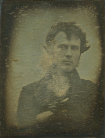
Robert Cornellius (1839) ‘Self-portrait’ . – possibly the first self- portrait and daylight picture of the history.
On the other hand, the American photographer, Susan Sontag talked, in a rather pessimistic tone, about pictures of ourselves taken by others and how these photographers contribute to the “mortality, vulnerability, mutability” of the subject photographed. I specially found this point really interesting and not widely considered although it is the truth.
Reference List
Barthes, R. (1981). Camera lucida. New York: Hill and Wang.
Benjamin, W. (1936) The Work of Art in the Age of Mechanical Reproduction.
Homer, N & Ingham, M (2016) ‘Photography and Fiction: Pose!” [Lecture to GMD1] T303: Contextual and Theoretical Studies. UAL
Proust, M (1913) In searhc of the Lost. Éditions Grasset, Éditions Gallimard
Sontag, S. (1977). On photography. New York: Farrar, Straus and Giroux.
I guess it might be inevitably to think that the society we live in will change every time a new invention comes up, and this is both frightening and thrilling at the same time. It already happened with the telegraph in the 1840’s, the radio in the 1900’s or the TV in the 1920’s. There’s this fascination about the new yet mixed with hesitation.
The debate about the death of print doesn’t come us a surprise although it is been emphasised by the appearance of digital formats such as online publications or e-readers. Indeed at the beginning of the 20th century there were already some artists and philosophers that already dared to predict the depict future of 2000 due to all the technology innovations.
The French artists Villemard’s postcard from 1910 predicting the 2000 depict future.
The famous graphic designer, David Carson claimed the death of print in his 1995’s book “The End of Print” by claiming that the imagery would take the lead and supporting the position of the Canadian philosopher Marshall McLuhan about the influence of technology on printing. Nowadays, fully living immersed in those technological inventions, there are still people reluctant to just rely on the new digital methods and stays by the side of the traditional means.
The Japanese graphic designer Kenya Hara is one of those who still believes in the magic of printing. He stated that “technology has no point unless it subtly awakens and activates the sense of its recipients” and exemplified our situation by naming one of the greatest talents of all times: “Leonardo da Vinci created magnificent paintings. There is absolutely no one today who can paint this way. We must believe that this fact is due tot the loss of sensitivity and wisdom so obvious in his work. The same can be said of the skills of skinning apples or writing letters by hand. The necessary sensory perceptions and receptivity have begun to fade away.”
Definitely one of the most important points about the traditional printing is the fulfilment and satisfaction that a physical product produce on us. As human beings, we like to get all our senses involved in the experience. On the other hand, digital publications out stand for its immediacy and wider range of colours on the screen.
Hara stated that “computer can bring us sensations that were beyond the reach of designers of the past. It inspires in us such a dynamic and uplifting motivation that we’re persuaded to abandon our antiquated sensory approach.”
In order to realise by ourselves the reasons why we choose printed products, we were required to make a list of our more meaningful printed medias in our life story and give the reason why they are so significant. This is my list
The visa stamp for the UAE on my passport.
A little pocket calendar of 1997 (the year I was born).
All my personal diaries in which I wrote about my childhood and teenager years.
My first official certificate in English
Postcards from my German friend travelling the world.
My artistic sketchbooks
Tags from my favourite clothes.
Cinema tickets
My endless list of “Movies I have to watch some day” in a A5 notebook.
A goodbye letter from my best friend.
The visa stamp on my passportPostcards from my German friend
My little pocket calendar from 1997 and its little painting on the back
To finish the lecture, we went across various printed independent publications that were worth mentioning due to their particular and memorable features and high quality. Such as the Austrian magazine ‘Vangardist’ which was printed using ink mixed with HIV positive blood or the ‘Vogue Gold Millennium Issue’ from December 2000.
‘Vangardist’ magazine, HIV positive blood issueVogue “The Millennium Gold Issue”, December 2000
Actually, despite the strong impact of the digital medias, the print is still a trend chosen for many for more independent, exclusive and thoughtful products, as there’s still zine fairs, for example and many brands and editorials that rather prefer to make short carefully treated runs -revivalist print-, than long cheap runs.
To sum up, I would like to cite the letter of American designer Jessica Helfand in the last editions of ‘The End of Print’ to her daughter: “Print isn’t dead, sweetheart. It’s just sleeping.” She argues that as long as reading would exist, print won’t die and that reading is something that will never die as “reading is your ticket to the world”.
Reference List
Baines, J & Sykes, R. (1016) ‘Think Ink!’ [Lecture to GMD Year 1] T303: Contextual and Theoretical Studies. UAL
Carson, D. and Blackwell, L. (1997). David Carson. New York, NY: Universe Pub.
Hara, K. (2007). Designing design. Baden, Switzerland: Lars Müller Publishers.
The purpose of this lecture was to present all the ways, the technology and particularly the net have affected the message and the way we communicate nowadays.
The first point made was through a serie of Google Street Views. All those photographies represented different and perplexing exacts moments happening in a common world. In other words, various disconcerting realities taking place at the same time. This collection of pictures is actually a particular and painstaking research that created the “9 eyes” project by the Canadian artist and essayist Jon Rafman.
Pictures from Jon Rafman from his ‘9 eyes’ project, showing different realities going on at the same time.
This was, indeed, an example to realise the infinite possibilities that the network offers us just with a few clicks. Is about this immense and easy accessible world of what the Spanish sociologist, Manuel Castells, discusses in his book “The rise of the network society”, (1996). He stands that the 95% of the information existing about every field is digitalised and that the 2.5 billions of the entire 8 billions population has access to Internet.
The truth is that technology is drastically changing the society and the way we communicate with others as the instantaneity of the online platforms is taking the lead whereas the physical interaction seems to be more and more complicated nowadays, as it requieres both people in the same place at the same time rather than a couple of screens to type on. And, obviously as the means of communication change, so does the way we express the message. And this is exactly what he Canadian philosopher Marshall McLuhan stated in 1964 in his book ‘Understanding Media: The extensions of Man’:
“In a culture like ours, long accustomed to splitting and dividing all things as a means of control, it is sometimes a bit of a shock to be reminded that, in operational and practical fact, the medium is the message. This is merely to say that the personal and social consequences of any medium—that is, of any extension of ourselves—result from the new scale that is introduced into our affairs by each extension of ourselves, or by any new technology.”
About technology and our response towards them, he wrote:
“Perhaps the most obvious “closure” or psychic consequence of any new technology is just the demand for it. Nobody wants a motorcar till there are motorcars, and nobody is interested in TV until there are TV programs. This power of technology to create its own world of demand is not independent of technology being first an extension of our own bodies and senses”
That’s why Internet caused such a vast effect on our daily lives, as it become another “extension of ourselves “ as the radio or the TV did at the time.
In order to understand properly the concept of the medium being the actual message, we were ask to write down a sentence that hadn’t ever been said before and to post it in different social networks. Mine one was:
‘Spoons of cereals are marrying slices of apple in a sledge of toast’
This way we could see how our nonsense message was changing according the platform -medium- we were using. For instance, in Twitter we needed to make it fit the 1400 characters, if we sent it through email to Andrew, it needed to be little bit more formal. Therefore, in all the cases the message was exactly the same but we transformed the way we conveyed it.
The other main topic of the lecture was the photographies and its importance in nowadays society and our relation with them. According to the famous photographer Susan Sontag, pictures are just used to prove reality. That is to say, that something doesn’t becoming real until there is a picture of so. Similarly she also supports the idea that “to photograph is to appropriate the thing photographed. It means putting oneself into a certain relation to the world that feels like knowledge-and, therefore, like power”. Indeed, an idea that shouldn’t come us as a surprise in our materialistic and selfish society. The Argentinean writer, Jorge Luis Borges, already stated so in his quote “The map is not the territory”. In fact, this metaphor can not only be related to photographies, but to the net: having all the information on the online sources -map-, doesn’t actually mean that we gained all that knowledge -territory-.
The quote from Borges “The map is not the territory”
And to finally link both concepts, photography and net, we discussed about the ‘poor images’, something almost inherent to the new technologies and the fact that we assume that poor quality images aren’t acceptable in certain circumstances but completely inadmissible in other cases. A good example of poor image was the “emojis” or the bad connection images on Skype. In those cases, what’s important is to receive an image but it doesn’t matter if it’s not a hd one. We concluded the lecture distorting the code of an emoji by including in the code our nonsense sentence.
Emoji with the distorted code
All in all, it was an engaging lecture that proved the influence of new technologies and the endless sources of information on the way we express ourselves and particularly in the imagery we consume.
Reference List
Borges, J. L. (1946) ‘On exactitude in Science’ Los Anales de Buenos Aires.
Jon Rafman (no date) Available at: http://9-eyes.com (Accessed: 4 May 2016).
McLuhan, M. (1964) ’Understanding Media: The Extensions of Man’. New York: McGraw Hill
Slatter, A & Harnett, J.P. (2016) ‘The net’. [Lecture to GMD Year 1] T303: Contextual and Theoretical Studies. UAL
Sontag, S. (1977) ‘On photography’ New York: Farrar, Straus and Giroux.
Sontag, S. (2004) ‘Regarding the pain of others’ London: Penguin Books.
What is it exactly home? What is the actual meaning behind the term ‘home’? We often relate it to the place were we belong and were our roots are, a place where we simply feel safe and comfortable. However, ‘home’ happens to be a far rougher concept. For instance, an igloo can definitely be home for inuits, but it is obviously not factual for everyone.
We were presented during the lecture the case of ‘Pruitt-Igoe’ which was a large complex of public houses in St. Louise, Missouri, designed by the architect Minoru Yamasaki, known for the design of the World Trade Center. The purpose of this urban plan was to solve the problem of overcrowding that was existing back then in the streets. It was first occupied in 1954 and since then its state started to decline like the luxury building of the Ballard’s novel ‘High Rise’ (1975) where the ideal complex starts an internal war. The complex was finally demolished in 1972, which was claimed to be “the death of modern architecture” by Charles Jencks, an American architectural theorist.
“Pruitt-Igoe”, the architectonical design of public buildings in St. Louise. (1954).
Cover of Ballard’s novel “High-Rise”
Since then, the vision of our personal spaces changed and there began to be isolated building for very concrete purposes such as schools, shopping centres, airports. Each of them with its own feeling, its own atmosphere.
This lecture was particularly addressed to makes us wonder what’s our relation with the space, whether our behaviour change when we are at home or away and why we feel free away from home although our roots call us to come back.
Our identity is somehow linked to the place we are coming from: home. It is so essential for our own identity that it is reflected on something as common as the Passport. And definitely this piece of information on this piece of paper will with no doubt determinate were else you would be able to go, for example, as not all passports are accepted everywhere. On the other hand, though, there are people that don’t feel identified by their native country and feel that home might be somewhere else. And, at the same time, I wonder myself what is home nowadays for all those who never stop travelling for business reasons, for instance. Do they have more than a place called ‘home’? But at the same time, the meaning of ‘home’ itself is inherently linked to one and only concrete place.
Passports of the world that proves where we all come from.
This last point can be linked to the second part of the lecture where we have been introduced to the concept of the ‘non places’. That is to say places with no memory, no history, no sense of identity. Airports are such a good example since they are places where people just go there to be guided to get to somewhere else, you are irrelevant and anonymous.
Milton Keynes, is a ghost experimental city 45 miles north-west of London created to solve the overcrowding problems in London but turned to be just a place to visit and leave. This artificial city can be considered as a non-space too due to its lack of identity.
The artificial city of Milton Keynes.
Another interesting concept is the simulated spaces which are those unreal environments that just resemble other but are just fake images. Those would, for instance be, themes parks such as Disneyland were the princesses get “smiling training” before they start working, or Los Angeles which is an ideal city where everything pretends to be as it is supposed to be.
Reference List:
Augé, M. (1995) ‘Non-places: introduction to an anthropology of super-modernity.’ Verso Books
Ballard, J. G. (1975) ‘High-Rise’
Baudrillard, J. (1983) ‘Simulation and Simulacra.’
Hauer, G & October, D (2015) ‘Space and Place’ [Lecture to GMD Year 1] T303: Contextual and Theoretical Studies. UAL
This is the sentences that all citizens of the George Orwell novel “1894” have stuck in their minds. However, the reality outside this dystopian world in permanent war is not that different: God has always been that ‘Big Brother’ that could literally see everything.
Similarly, there are other symbols all around us in our daily life such as The Eye of Providence in the USA dollars bills. This, today considered Illuminati Eye, was first related to gods since the Ancient Egypt times and later on, in 1797, taken by Thomas Smith Webb, author of the “Freemason’s Monitor”, as an illustration of Masonry. Then, the “All-seeing-eye” became a symbol of secret societies, power and conspiracy.
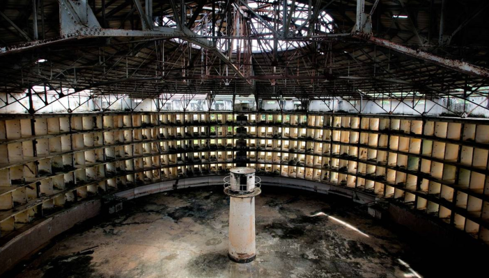
Constant surveillance was believed to be essential to keep people under control. Nevertheless, there was someone who dare to go little bit further. The philosopher and father of utilitarianism, Jeremy Bentham, laid down the theory that “power should be visible and unverifiable” with his new prison system, the ‘Panopticon’.
This new idea of prison consisted of a rounded building with a tower in the middle and all a the cells around following the round shape. Since the tower is mirrored, no one would be able to tell whether there might be someone in the tower or not, and therefore, all the prisoners will live with the idea that there can always be watched.
Example of the Panopticon system
Despite how efficient it was, the French historian and physiologist Michel Foucault argued in his 1975 book “Discipline and Punish” that “…the Panopticon must not be understood as a dream building: it is the diagram of a mechanism of power reduced to its ideal form; its functioning, abstracted from any obstacle, resistance or friction, must be represented as a pure architectural and optical system: it is in fact a figure of political technology that may and must be detached from any specific use.”
Nonetheless, this idea of the omnipresent and invisible power was not only applied to prisons but, once again, to control the entire population. As stated in by the essayist Niran Abbas in his book “CCTV: City Watch” only in the city of London there are approximately 4,2 millions of CCTVs and anyone who would wander around can easily be captured 300 times a day.
Taking this into account, it is easy to reckon that this is not only for the safety of the population but to record the behaviour of the society. Or maybe, just for the pleasure of gazing?
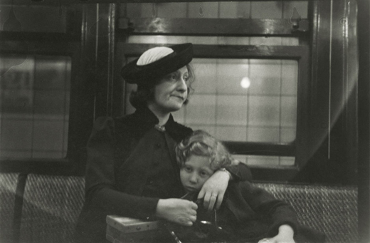
Throughout the history, many were the artists who found inspiration from voyeur practises. And, please, don’t think nasty, but there is an inevitable pleasure at staring at others. This can be reflected, for instance, in the work of many photographers such as the serie of pictures taken in the underground by the American Walker Evans or the ones from the window by the New York photographer Arne Svenson.
Photography by Walker Evans
Reference List:
Abbas, N (2003) ‘CCTV: City Watch’ in Kerr, J & Gibson, A. (Eds.) (2004) London From Punk to Blair. London: Reaktion Books.
Focault, M. (1975). ‘Discipline & Punish’. NY: Vintage Books
Glavey, P & Eysler, A (2015) ‘Sureveillance’ [Lecture to GMD Year 1] T303: Contextual and Theoretical Studies. UAL
Orwells, G. (1949). ‘1894’. London: Harvill Secker.
Smith Webb, T (1797) ‘Freemason’s Monitor’. New York: Crushing and Appleton.
There are things we have never wondered ourselves about. For instance, why are women who smoke linked to the concepts of femme fatal? Where is the origin of this widespread belief? The answer to the mystery is the penis. Yes, you read it right! According to the father of the psychoanalysis Sigmund Freud, the cigarettes subconsciously meant penis to women. In other words, women that would smoke were actually challenging the power of men, as a century ago women could not be seen smoking in public. Edward Bernays, nephew of the Austrian neurologist mentioned above, was the man who changed that and renamed cigarettes as “the torches of freedom” linking the idea of females smoking to powerful and independent women. Since then, the sales of cigarettes increased abruptly.
Photograph of a woman smoking for the cover of the magazine ‘Life’.
Frame of the documentary “The century of self” – the debutants smoking in front of the press for the first time.
This is probably the most meaningful example (and my favourite one) of how easy is to manipulate the mass using the knowledge and studies about human behaviour from Sigmund Freud (1856 – 1939). This first part of four BBC documentaries begins introducing the audience the key idea that Bernays used to link mass produced goods to people’s desires: “there are primitive, sexual and aggressive forces hidden inside the minds of all human beings” and that “those forces that are not controlled lead individuals and society to chaos and destruction.”
The documentary strongly emphasises with live witnesses from those years fact that before that “social live experiment” started, no one was able to show in public their inner feelings and how people was keeping under control their desires by painfully suppressing them. Thus, the viewers can assume that beginning to talk about their own desires meant a liberation during the last years of the 19th century.
Moreover, it chronologically explains the start and establishment of consumerism in our society and the beginning of the mass democracy, which is the participation of the entire population of a country in the presidential elections instead of just the ‘privileged’ ones. For instance, when USA decided to take part in the IWW in 1914 “to bring the democracy to all Europe”. In this particular case, Bernays was required to portrait president Woodrow Wilson as “the man that made this world free” and made him become a hero of masses. After that, Bernays wondered himself whether he could produce the same effect on people in “peaceful times” as well.
A frame of the documentary “The century of self” – the crowd.
And, indeed, he did it. Every company that required his services was only increasing their sales, doesn’t matter if it was the American Tobbaco Company or any retail company or even banks, all of them were indirectly taking advantage of Freud’s studies. Products were no longer presented as needs nor as desires, but just as goods that might talk by yourself. The way you dressed like was telling who you were, the car you were driving was telling which kind of driver you were, if you smoke… if you don’t…
In the other side of the coin, Freud began to write about human behaviours. He realised he had underestimated human instincts and that human beings were easily controllable in groups. That’s how he came up with the idea that democracy was probably not as factual as everyone thought, – like the philosopher Plató and many others discussed hundreds of years ago, or as would claim Adolf Hitler years later.- and therefore dismissed the idea of trusting people despite their rational state, as their subconscious could still be manipulated.
Sigmund Freud (1856 – 1939)
And that’s the story of how his nephew made Freud lose all faith in human beings and become a pessimist while creating the bases of a new empire, that not even the Market Crash in 1929 nor the IIWW could pull down. This documentary sums up with an accurate flow all the mark spots that led our society to be considered the “century of self” at the same time that narrates how the shadow of Freud was following all the changes that were taking place meanwhile Bernays was using the crowd for his puppet show.


![Collage (1919) von Hannah Höch [1889 - 1978]Bildmaß 114 x 90 cmInventar-Nr.: NG 57/61Systematik: Geschichte / Deutschland / 20. Jh. / Weimarer Republik / Kulturleben / Kunst und Literatur](https://i0.wp.com/albasays.wordpress.com/wp-content/uploads/2016/05/hannah-hoch.jpg?w=362&h=449&ssl=1 "hannah-hoch")


")
")


 Photograph of a woman smoking for the cover of the magazine ‘Life’.


